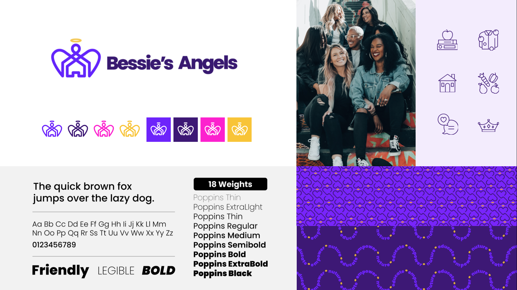
BESSIE’S ANGELS
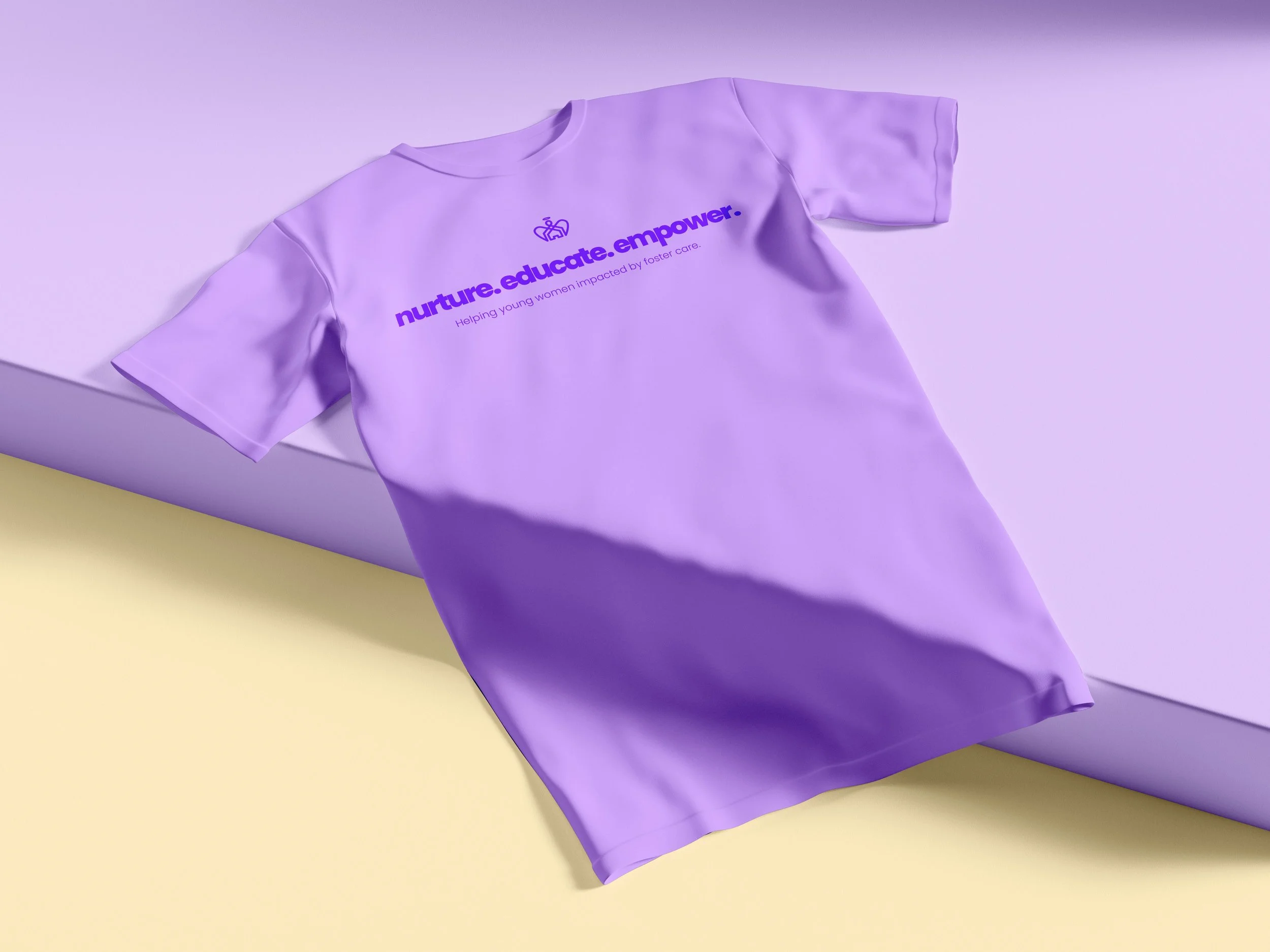
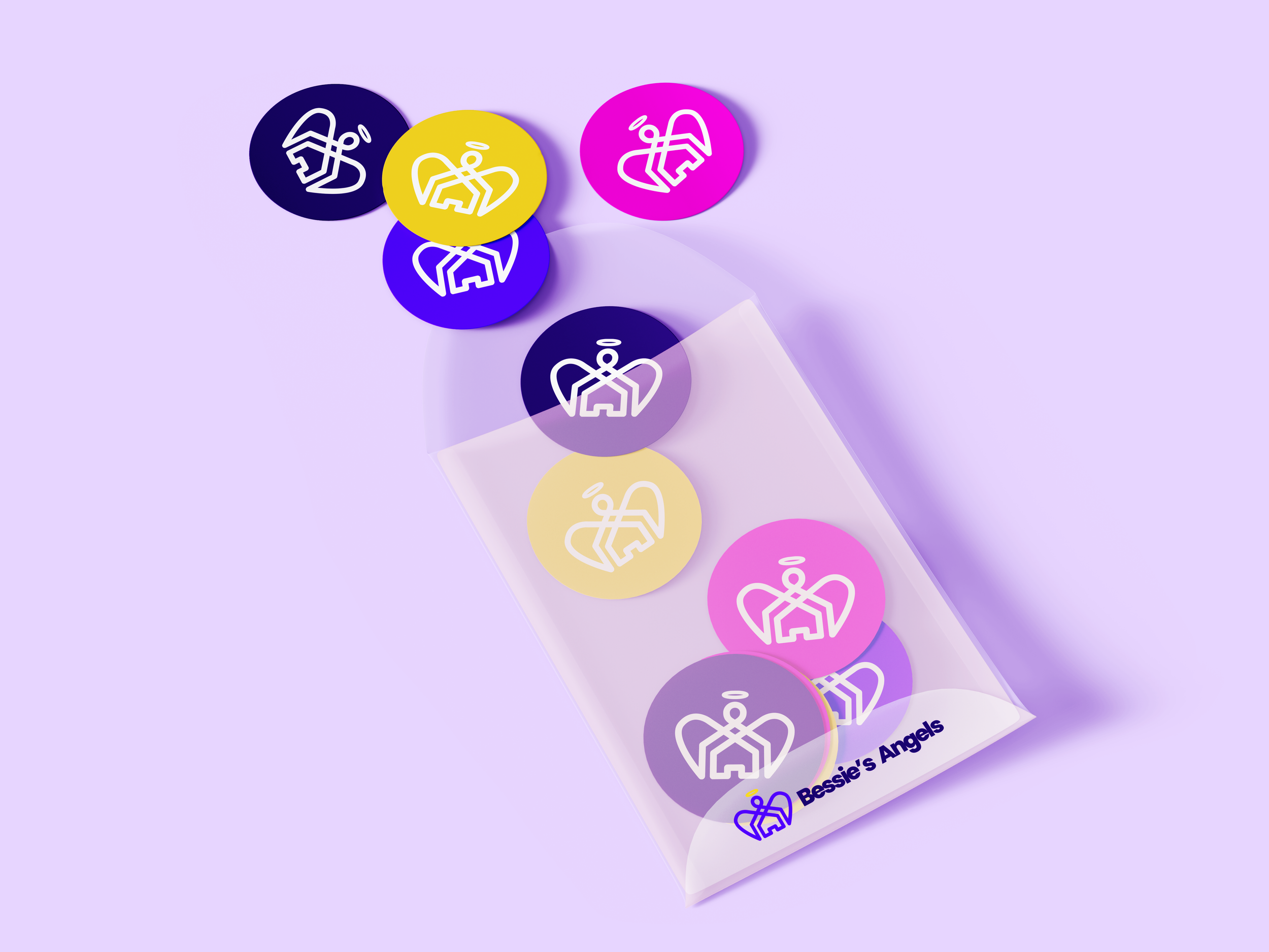
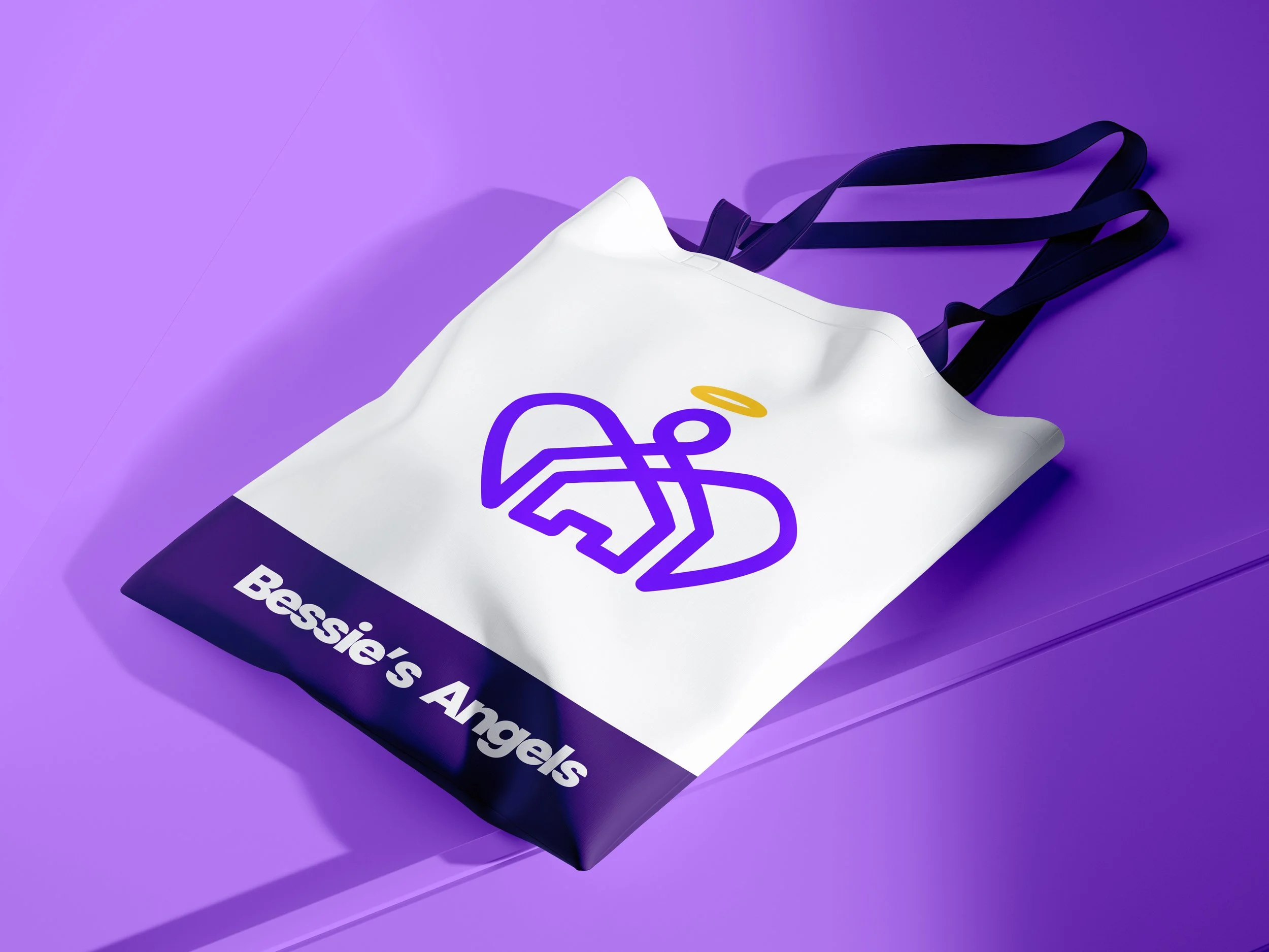
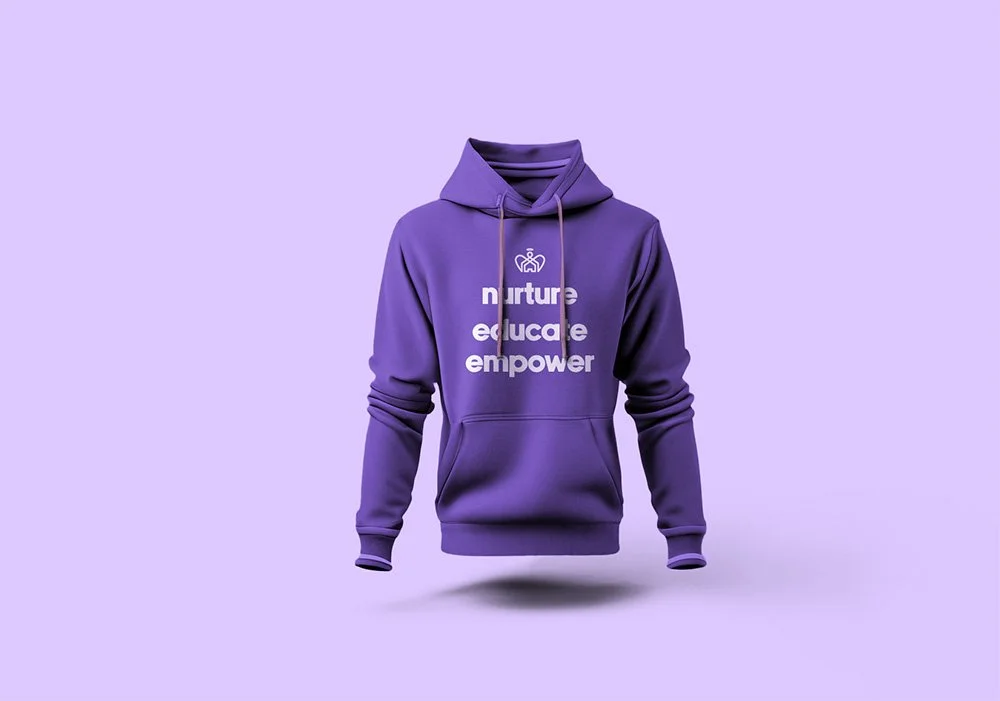
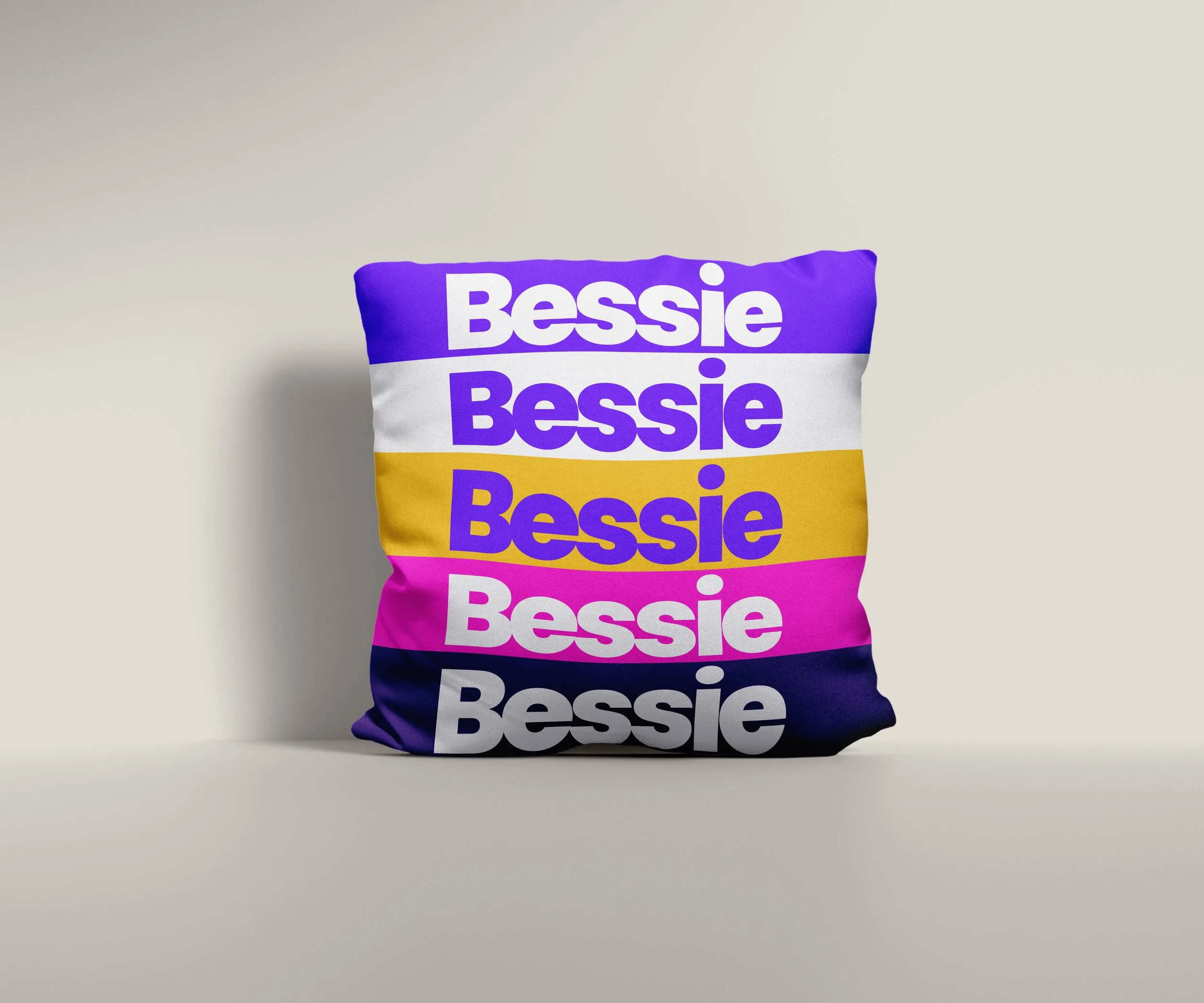
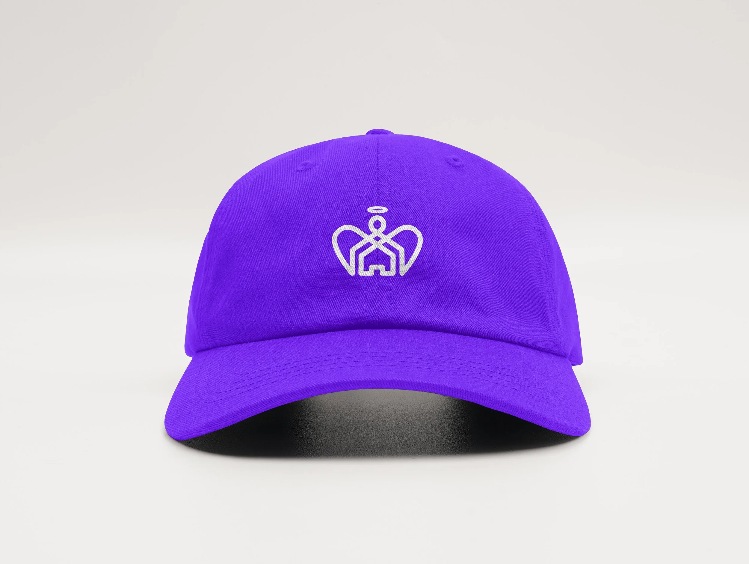
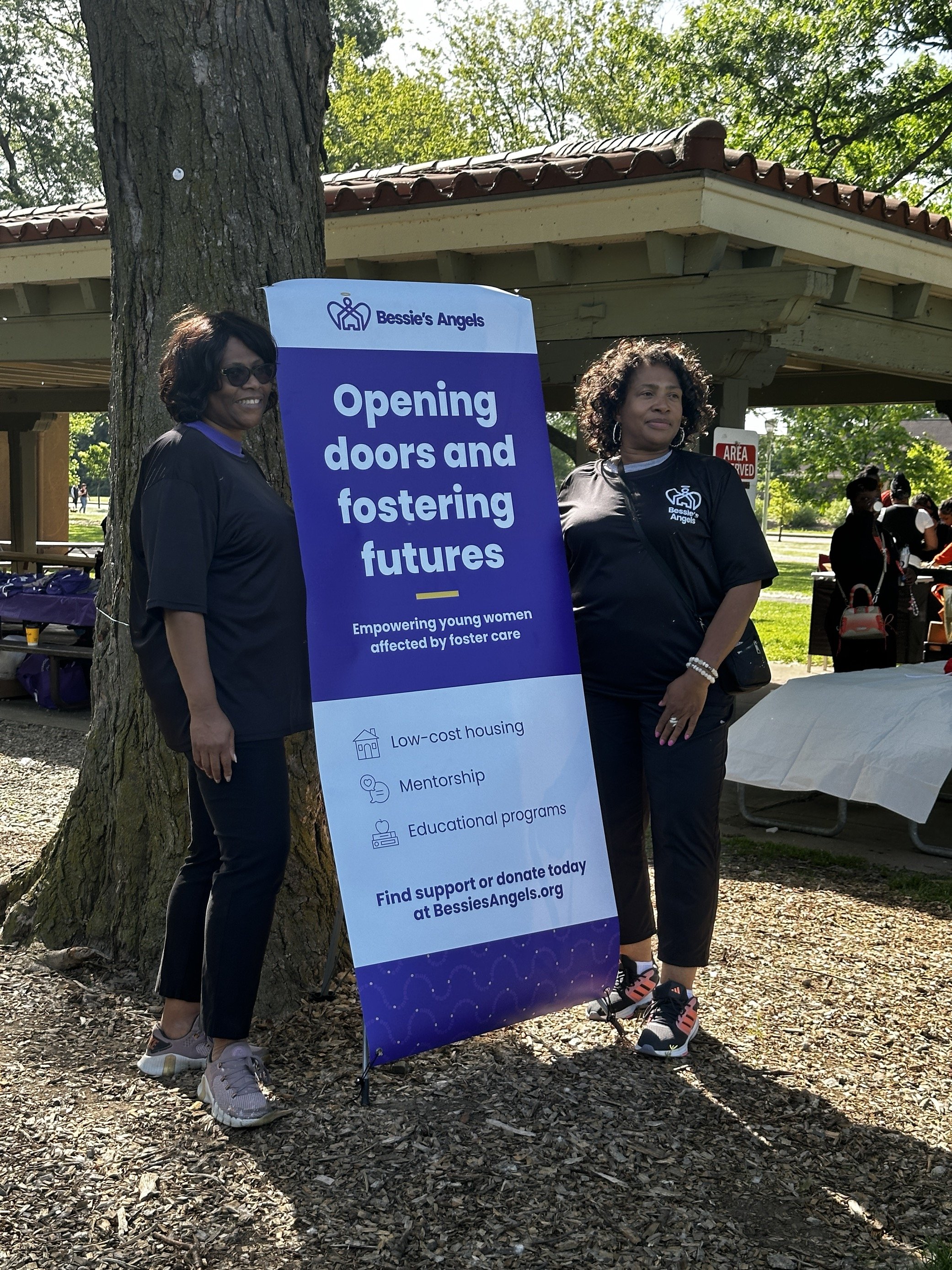
The rebrand of Bessie’s Angels reimagined how the Cleveland nonprofit supports young women impacted by foster care, creating an identity that feels as strong and compassionate as its mission. A continuous-line logo symbolizes stability and connection, while a vibrant palette of purples and yellows conveys creativity, warmth, and hope. Every element, from the rounded typography to the inclusive tone of voice, works together to welcome, educate, and empower—reflecting an organization devoted to opening doors and fostering futures.
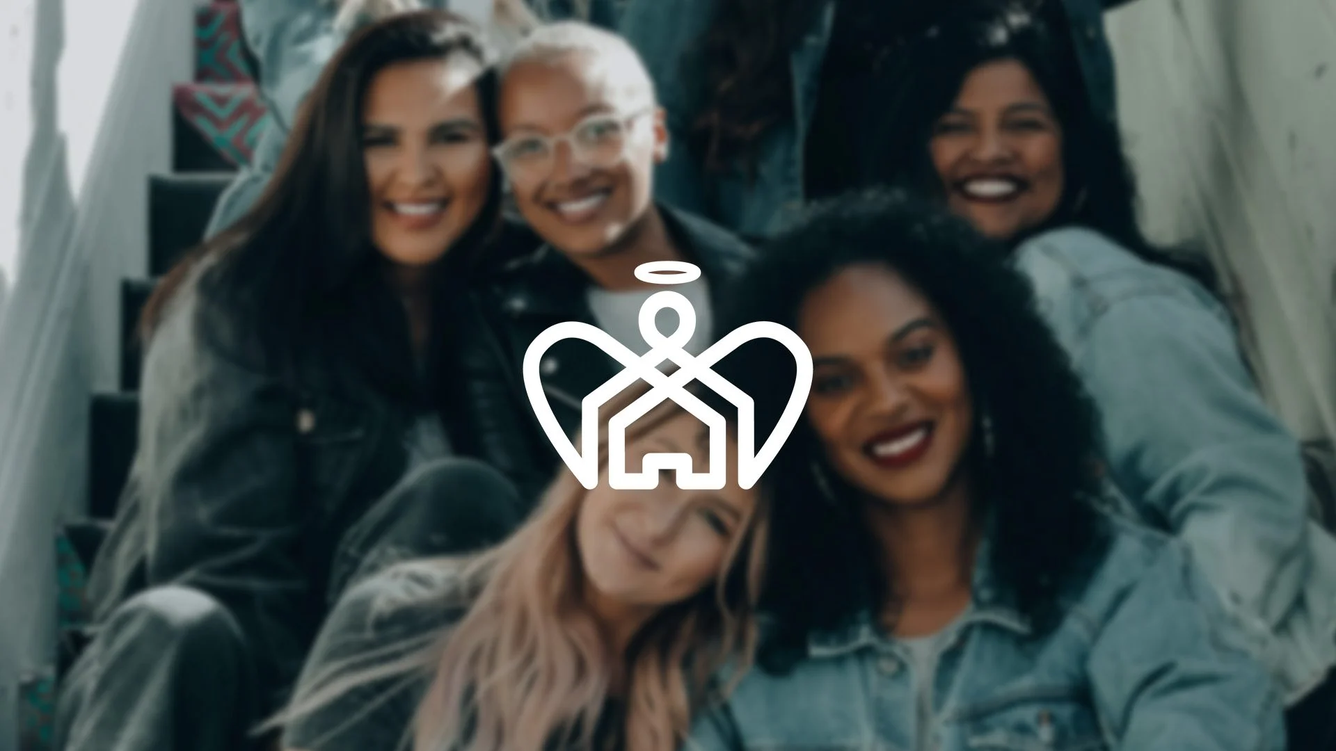
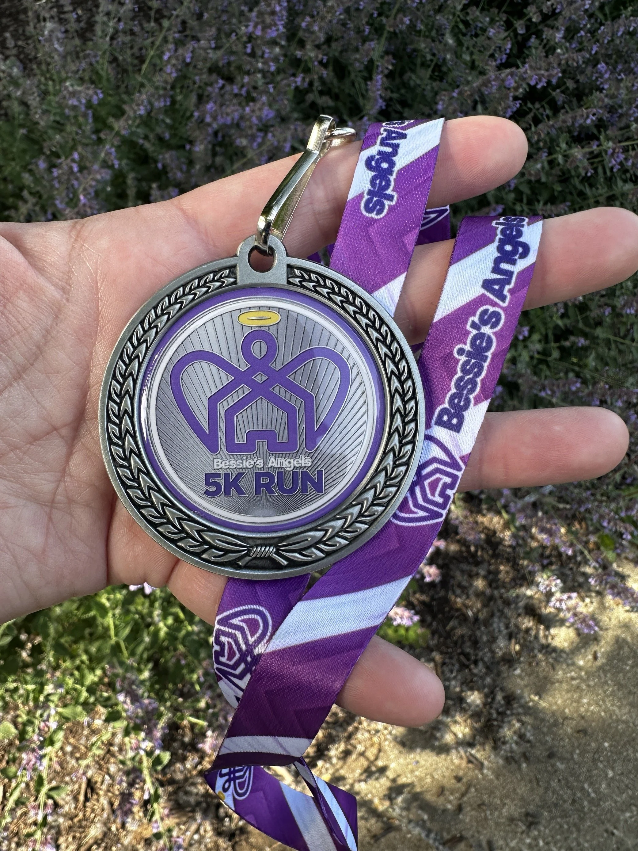
Drawn in a single, unbroken line the new logo forms an angel protecting a home, symbolizing the organization’s strength, stability, and connectedness.
Primary Full Color Logo
Full Color Logo (Horizontal)
One Color Logo (Horizontal)

All of the above work was done as part of a team of creatives at Ninety6. This includes Kristin Blaser, Andrew Christopher, Hilary Demko, Danielle Dwyer, Caroline Hayes, Erin Lyman, Melanie Mescher, Mike Monar, Marisa Pedraza, Karli Sensibello, Andreas Tabor, Todd Thompson, Dalon Wolford, Josh Womack, and Nada Youssef.